


Building beautiful graphs in React with Recharts | #1 - Bar Charts
Recharts is a popular graphing library for React developers. It makes it easy to build really powerful graphs, but it's a little harder to make them beautiful.


Background
If you’re looking to build truly beautiful graphs in React, I’m here to help! I started using Recharts a few months ago after being tasked with redesigning some PDF reports for my company’s client dashboard. We used a lot of graphs in these reports, and I knew we needed to find a more robust solution after bandaiding our existing solution (converting react-chart-js canvas elements into base64 strings) one too many times. I settled on Recharts due to its SVG-based output and component-driven design, which interfaced well with our PDF generation solution (React-pdf) through a wrapper library (react-pdf-charts). Recharts also has an extremely responsive and very helpful team of maintainers, which is a huge plus.
Since my first introduction to the library, I’ve used Recharts to create several different data visualizations. Most recently, I led a top-to-bottom UI overhaul of one of our primary products, and discovered a lot of neat tricks through trial and error which aren’t particularly well documented online, at least all in one place. So, in this article I’ll walk you through the step-by-step creation of a real graph component I built in our dashboard with everything I’ve learned along the way. This will be the first in a multi-part series, documenting creation of a couple different components and writing effective unit tests for these components.
Skipping to the good part
If you aren’t interested in going into depth on each individual Recharts/CSS trick present in my design and just want access to the end result (I’ve been there), you can find a finished code sandbox here. You can also view the full git repository with each step of this tutorial included as a separate commit. With that, let’s get started!
1. Spin up a basic BarChart component.
Within your React app, follow the documentation to install Recharts and styled-components. You definitely don’t need styled-components to use recharts, or even to really follow this tutorial in particular, but I write almost all of my CSS in styled-components and will be doing so here as well.
Real world context: The product I built this graph component for is an emissions reporting tool for mixed-fuel fleets (ie. companies that own both internal combustion engine vehicles [diesel, gasoline, etc]. and electric vehicles. We wanted to be able to show emissions that were generated by all the vehicles, and emissions that were avoided by driving alternative fuel vehicles, in one visual. To make this happen, we settled on displaying avoided emissions as ‘negative’ along the Y-axis and generated emissions as ‘positive’, in a graph of ‘Total GHG Emissions’.
Our data is proprietary, so for the purposes of this tutorial, and in keeping with current world events, I’ve generated some dummy data representing the monthly American fruit trade deficit in 2022. (I’ve made these numbers up, so White House economic advisors, if you see this, please don’t base any new tariff schemes off these...)
We’ll group all imported fruit in one category, ‘Imports’, and all exported fruit into, you guessed it, ‘Exports’. Here’s our basic data structure, with imports and exports listed in millions of US dollars:
const FruitTradeDeficitMonthlyData = [
  {
    month: '2022-01-01',
    exports: 1258,
    imports: -1693
  },
  {
    month: "2022-02-01",
    exports: 1187,
    imports: -1589
  },
  {
    month: "2022-03-01",
    exports: 1321,
    imports: -1754
  },
  ...
]
Now, let’s build our main component! You can reference the Recharts docs here if you’ve never used the library before. Below, I’ve set up a simple GraphCard component. First, I built a card-style wrapper with styled-components. Inside an instance of that wrapper, I nested a BarChart.
import { Bar, BarChart, Label, Legend, ReferenceLine, Tooltip, XAxis, YAxis } from 'recharts';
import styled from "styled-components";

const CardContainer = styled.div`
  border: 2px solid gray;
  background-color: white;
  width: min-content;
  padding: 10px;
  margin: 20px;
`;

const GraphCard = ({ data, height, width, xAxisKey, yAxisLabel }) => {
  return (
    <CardContainer>
      <BarChart
        width={width}
        height={height}
        data={data}
        margin={{ left: 10 }}
        stackOffset='sign'
      >
        <XAxis dataKey={xAxisKey} />
        <YAxis type='number'>
          <Label
            angle={-90}
            position='left'
            style={{ textAnchor: 'middle' }}
          >
            {yAxisLabel}
          </Label>
        </YAxis>
        <Tooltip />
        <ReferenceLine y={0} stroke='gray' />
        <Bar dataKey='exports' name='Exports' fill='blue' stackId={0} />
        <Bar dataKey='imports' name='Imports' fill='green' stackId={0} />
        <Legend />
      </BarChart>
    </CardContainer>
  );
}

export default GraphCard;
A couple things to point out on the initial setup of our BarChart component:
The
stackIdandstackOffset='sign'props really do all the heavy lifting for us here. As long as we declare imports as negative and exports as positive, Recharts will automatically place each bar on the correct side of the Y axis, and stack them on top of each other, as long we match the stackIds and declare thesignoffset.I’ve nested the
Labelcomponent within theYAxiscomponent so that I can customize its position. I’ve added the margin prop to the parent component to ensure the shifting of the Label doesn’t cause it to run off the left-hand side of the container.The xAxisKey should match the ‘label’ you’re using for each month of data in your graph.
My App.js imports the GraphCard component and passes the dummy data I previewed above as its data prop.
import React from 'react';
import GraphCard from './GraphCard';

function App() {
  return (
    <GraphCard
      data={FruitTradeDeficitMonthlyData}
      xAxisKey='month'
      yAxisLabel='Millions of USD ($)'
      height={500}
      width={1000}
    />
  );
}

export default App;

const FruitTradeDeficitMonthlyData = [...]
Our graph looks like this:
Not bad for a few minutes! But, we’ve got some work to do before our component gets here:

2. Improve the basic design of our graph (import custom fonts, add a title, and implement responsive design)
Before we unlock the superpowers of the BarChart component itself, let’s take a step back and focus on the container it’s in. We’ll want to spruce up the design of the card itself and bring in some nice custom fonts.
First, let’s import the Inter font family from Google Fonts in our index.html file:
<link href="https://fonts.googleapis.com/css2?family=Inter:wght@400;500;600;700&display=swap" rel="stylesheet">Now we can tidy up our CardContainer component. We’ll add some shadow, a custom border color, round the radius, and of course utilize the new font.
const stroke_gray = 'hsl(210, 5%, 90%)';

const CardContainer = styled.div`
  background-color: white;
  border: 1px solid ${stroke_gray};
  box-sizing: border-box;
  padding: 20px;
  margin: 20px;
  box-shadow: 0px 0px 10px 0px hsla(0, 0%, 0%, 5%);
  border-radius: 16px;
  width: min-content;
  font-family: 'Inter', sans-serif;
`;
The new font should be automatically inherited by every text element in our Recharts component. It’s looking way sharper already!
Now, let’s add a title element to our card. For better or worse, Recharts does not provide a built-in title component, unlike most other graphing libraries. In this case, since I created a custom title layout anyway, I didn’t particularly miss this feature, but many other users find this frustrating. If you need a title element centered relative to your graph, you could use Flex or similar to accomplish this.
We’ll also increase the margins of our chart so that everything fits within the container (Recharts seems to have a bit of trouble with margin calculations once labels are involved) and we get some breathing room between the title and the graph:
const off_black = 'hsl(210, 5%, 15%)';
const darkest_gray = 'hsl(210, 5%, 30%)';

const CardTitle = styled.span`
  font-size: 1.25rem;
  font-weight: 500;
  color: ${off_black};
  &:after {
    content: ' ';
  }
`;

const CardSubtitle = styled.span`
  font-size: 1.25rem;
  font-weight: 400;
  color: ${darkest_gray};
`;

const GraphCard = ({ data, height, width, xAxisKey, yAxisLabel, title, subtitle }) => {
  return (
    <CardContainer
      width={width}
      height={height}
     >
       <CardTitle>{title}</CardTitle>
       <CardSubtitle>{subtitle}</CardSubtitle>
       <BarChart
         data={data}
         stackOffset='sign'
         width={width}
         height={height}
         margin={{ left: 13, top: 20, right: 10 }}
         ...
A few notes on how I’ve set up the title and subtitle elements:
I’m using
remunits for the font size. Josh Comeau has published an excellent article on using rem vs px which I highly recommend reading for a quick, elegant explanation of size unit use as it relates to web accessibility.I’ve utilized the nifty CSS pseudo-element after to maintain spacing while still respecting the user’s browser font size. The empty space character will grow along with the regular text, so we’ll always have a consistent, proportional space between the title and subtitle if the user is using browser level font scaling. There are lots of ways to do this, I just think this one works well!
I’ll also pick some less glaring colors for our bars and reference line (you can read more about using the HSL format in another great interactive article from Josh Comeau) and round the corners of the bars to create a nice rounded rectangle effect:
const dark_gray = 'hsl(210, 5%, 45%)';
const exportFill = 'hsl(205, 90%, 30%)';
const importFill = 'hsl(155, 90%, 25%)';
const barRadius = 16;
const radiusArray = [barRadius, barRadius, 0, 0];
...
  <ReferenceLine y={0} stroke={dark_gray} />
  <Bar
    dataKey='exports'
    name='Exports'
    fill={exportFill}
    stackId={0}
    radius={radiusArray}
  />
  <Bar
    dataKey='imports'
    name='Imports'
    fill={importFill}
    stackId={0}
    radius={radiusArray}
  />
...
A note on the radius prop: If we were to simply declare radius={16}, all four corners of every rectangle (for example, the imports for the month of June) would be rounded. It’s important to realize that Recharts generates each “bar” as an individual SVG element. It’s not drawing a single rectangle for each month and painting half of it blue and half of it green, it’s drawing one rectangle for each data point and then applying all our provided styles to each element. So, we need to tell it that we only want the ‘top left’ and ‘top right’ corners to be rounded, by passing it an array of numbers just like we would to draw unique radiuses on each corner of a regular HTML element via CSS. The upside here is that Recharts is clever enough to determine that the ‘top’ of a negative bar is actually the ‘bottom’ when it’s displayed in a bilateral context.
We’re looking good!

Before we conclude this step, let’s think about responsive design. Right now, our component is totally static. If you’re building a modern website, you probably want most components to have some level of responsiveness. In my case, this graph card was part of a larger arrangement of unique cards within a dashboard, and I wanted every card to grow in width as the user adjusted their browser window (up to a reasonable limit). Recharts provides a ResponsiveContainer component which handles this exact situation. You can wrap your BarChart component with one, and then provide it a dynamic width or height (or use the aspect prop if you need it to scale in both dimensions.) You’ll notice I’m using style props in the expanded component below - if you haven’t seen these before, you can read up on them here.
const CardContainer = styled.div`
  ...
  height: ${({ height }) => height ? `${height}px` : 'auto'};
  width: ${({ width }) => width ? `${width}px` : 'auto'};
  min-width: ${({ $minWidth }) => $minWidth ? `${$minWidth}px` : 'auto'};
  max-width: ${({ $maxWidth }) => $maxWidth ? `${$maxWidth}px` : 'auto'};
`;

const GraphCard =  ({ data, height, width, minWidth, maxWidth, xAxisKey, yAxisLabel, title, subtitle }) => {
  return (
    <CardContainer
      height={height}
      width={width}
      $minWidth={minWidth}
      $maxWidth={maxWidth}
    >
      ...
      <ResponsiveContainer
        height='100%'
        width='100%'
      >
        <BarChart
          ...
We will no longer pass min/max width to the BarChart, since the ResponsiveContainer will take care of the chart’s dimensions for us. Also, notice that I used transient props for minWidth & maxWidth within the styled component - otherwise, we’ll get a DOM warning from React. I’ll need to pass minWidth and maxWidth props to our GraphCard in order to see the effects of our new responsive container:
function App() {
  return (
    <GraphCard
      data={FruitTradeDeficitMonthlyData}
      height={500}
      minWidth={600}
      maxWidth={1000}
    />
  );
}
Now, when we adjust the width of our window we should see the the graph card shrink and grow to match!

3. Improve the bar hover effects & tooltip
Now, let’s focus on some nifty Recharts effects to really make our hover functionality pop. First, we’ll want to update our data ingestion to provide a more extensible framework for customizing our visuals. There are several ways you could accomplish this - here’s how I’ve done it.
First, I’ll update our Bar declaration to use a map. While not strictly necessary, this will give us flexibility in how many items we can display (right now, we’d have to add a new Bar declaration for any additional set of data) and make it easier to style our bars. The existing approach isn’t necessarily a bad thing, but later on, we might want to split out our imports and exports into specific sub-categories, like apples and bananas, and we want this component to be as reusable as possible!
I’ve set up a new array of object styles in our App.js file, and passed it to the GraphCard via a new dataStyles prop:
const FruitTradeDataStyles = [
  {
    id: 'exports',
    displayName: 'Exports',
    fillColor: 'hsl(205, 90%, 30%)'
  },
  {
    id: 'imports',
    displayName: 'Imports',
    fillColor: 'hsl(155, 90%, 25%)'
  }
]
...

function App() {
  return (
    <GraphCard
      data={FruitTradeDeficitMonthlyData}
      dataStyles={FruitTradeDataStyles}
      ...
Within our GraphCard, we’ll iterate through the dataStyles array and generate a section of bars for each object in the list. Recharts will parse through our original data array and find the entry for each month that matches the style object’s id automatically.
const GraphCard = ({ data, dataStyles, height, width, maxWidth, minWidth }) => {
  return (
    <CardContainer>
      <ResponsiveContainer>
        <BarChart>
          ...
          {dataStyles.map((b) =>
            <Bar
              key={b.id}
              dataKey={b.id}
              name={b.displayName}
              fill={b.fillColor}
              stackId='stack'
              radius={radiusArray}
            />
          )}
        </BarChart>
      </ResponsiveContainer>
    </CardContainer>
  );
}
At this point, nothing should have changed in the appearance of your graph.
Next, let’s remove the tooltip’s default ‘cursor’ effect (that light gray background on hover), and instead, darken the actual hovered bar. We can easily achieve the former by passing cursor={false} to the Tooltip component. However, implementing the latter isn’t quite as simple. Recharts does provide some built-in hover styling via the activeBar prop, but this doesn’t really work correctly with stacked bars in my experience. Instead, we’ll use some custom state management to style the hovered bar. This will require nesting a Cell component within our Bar, so we can keep track of each individual month’s index:
import { darken } from 'polished';

...

const GraphCard = ({...}) => {
  const [hoveredBar, setHoveredBar] = useState(null);

  return (
    <CardContainer>
      <ResponsiveContainer>
        <BarChart>
          <Tooltip cursor={false}/>
          {dataStyles.map((b) =>
            <Bar
              ...
              style={{
                cursor: 'pointer',
                transition: `fill 0.2s ease`
              }}
            >
              {data.map((index) => {
                const barKey = `${b.id}-${index}`;
                const hoverKey = index;
                return (
                  <Cell
                    key={barKey}
                    fill={hoveredBar === hoverKey ? darken(0.05, b.fillColor) : b.fillColor}
                    onMouseEnter={() => setHoveredBar(hoverKey)}
                    onMouseLeave={() => setHoveredBar(null)}
                  />
                );
              })}
            </Bar>
          )}
        </BarChart>
      </ResponsiveContainer>
    </CardContainer>
  );
Several items to call out here:
I’m keeping track of the
hoverKeyandbarKeyseparately here because:React expects each child component generated in a map to have a unique key so it can keep track of state updates, so I need a
barKeyfor that purpose.However, I’m assuming that the user will want to see a shared tooltip that displays both the export and import data for the hovered month, and not display the exports and imports separately. To reflect that in the bars themselves, I want both the export and import cells to show darken simultaneously on hover. If you do not want this behavior, you can set
shared={false}on theTooltipcomponent and use thebarKeyfor both the map key and the fill color of each cell, no need for a less-specifichoverKey.
I added some styling to the
Barelement:I like to use the pointer cursor to indicate that something is happening when we hover over a bar. Some UI designers would probably disagree with my use of the pointer in this context, since the bars do not have a click event, which is what the pointer usually signals. Personal preference.
We’ll work on creating a fade-in appearance effect for the tooltip later which syncs up with the color transition.
I’m using the polished library here to darken the fill color by 5% on hover. I could also pass a
hoverColorwith each object in mydataStyleswhose third percentage in the HSL value (lightness) is reduced by 5%, but I’m using polished here because it’s an elegant and lightweight solution.
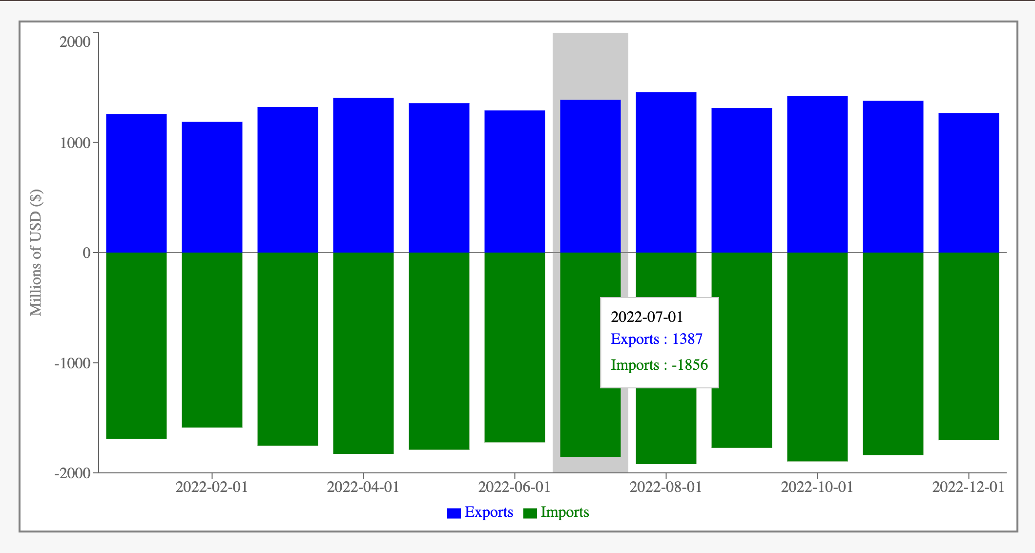
Now, let’s jazz up the tooltip itself. We’re going to use the Tooltip component’s content property (several Recharts components, like Label and Legend, also have this property available, as we’ll see later) to generate custom tooltips for each bar. This prop expects us to provide it with a function or React component, so let’s make one.
...

const HoverContainer = styled.div`
  padding: 10px;
  border-radius: 8px;
  background-color: hsla(0, 100%, 100%, 80%);
  box-shadow: 0px 0px 10px 0px hsla(0, 0%, 0%, 15%);
  backdrop-filter: blur(6px);
`;

const HoverTitle = styled.span`
  font-size: 1.1rem;
  font-weight: 500;
  color: ${off_black};
`;

const HoverContent = styled.div`
  font-size: 1.0rem;
  font-weight: 400;
  color: ${({ color }) => color || dark_gray};
  margin-top: 2px;
`;

const CustomTooltip = ({ payload, label }) => {
  return (
    <HoverContainer>
      <HoverTitle>
        {label}
      </HoverTitle>

      {payload.map((b) => {
        return (
          <HoverContent
            key={b.dataKey}
            color={b.fill}
          >
            {b.name}: {b.value}
          </HoverContent>
        );
      })}
    </HoverContainer>
  )
}

const GraphCard = ({ ... }) => {
  ...

  return (
    <CardContainer>
      <ResponsiveContainer>
        <BarChart>
          ...
          <Tooltip
            cursor={false}
            content={CustomTooltip}
          />
          ...
        </BarChart>
      </ResponsiveContainer>
    </CardContainer>
  );
How this works:
In my styled component declarations, I’ve set up a nice wrapper element with a semi-transparent blurred background and a shadow. Inside that wrapper, the text content will use a dark gray color unless an override is provided.
Within the
CustomTooltip, we grab thelabelfrom the destructured props and display it in aHoverTitleelement.We iterate through the
payload(in our case, it will always contain two objects, representing the exports and the imports for the hovered month) and generate a line of text for each: “[dataset name]: [value]”. If we didn’t want each line to be colored with the bar’s fill color, we could simply leave thecolorprop off.
Our hover now looks like this:

We’re looking good, just two more adjustments to make - let’s format the values in the tooltip, and add a fade in/out effect to the tooltip.
const formatMonthLabelLong = (dateString) => {
  const date = new Date(dateString);
  const options = { year: 'numeric', month: 'long' };
  return date.toLocaleDateString('en-US', options);
}

const formatValueInMillionDollars = (value) => {
  return `$${Math.abs(value).toLocaleString()}M`;
}

const CustomTooltip = ({ payload, label }) => {
  return (
    <HoverContainer>
      <HoverTitle>
        {formatMonthLabelLong(label)}
      </HoverTitle>

      {payload.map((b) => {
        return (
          <HoverContent
            key={b.dataKey}
            color={b.fill}
          >
            {b.name}: {formatValueInMillionDollars(b.value)}
          </HoverContent>
        );
      })}
    </HoverContainer>
  )
}
I’m also going to add a timestamp to every month in our FruitTradeDeficitMonthlyData array in App.js. This will prevent a situation where Javascript will parse the year and day correctly from your stringified date, but assume that the month is zero-based and format all your dates with the previous month. Dealing with time in code is hard.
const FruitTradeDeficitMonthlyData = [
  {
    "month": "2022-01-01T00:00:00",
    "exports": 1258,
    "imports": -1693
  },
  {
    "month": "2022-02-01T00:00:00",
    "exports": 1187,
    "imports": -1589
  },
...
Here’s what changed in the tooltip:
We added a helper function for the month title formatting. This will read in a date string,
‘07-01-2024’for example, and return “July 2024”.We added another helper function for the import/export value formatting. Notice the
Math.absmodifier - we are grabbing the absolute value of the number because the imports aren’t truly negative and we don’t want to display them as such. Then, we use.toLocaleString()to format the value with commas, and add an ‘M’ at the end to indicate millions.You can pass different formatting options to
toLocaleStringif you have specific internationalization requirements. You could also add any number of label display helper functions (and choose the specific function based on a new prop to the graph card) if you needed to display a variety of units and wanted to make the component as flexible as possible.
Lastly, let’s add an appearance fade effect. In my opinion, little transitions like this are what take your UI from good to great. The average user wouldn’t complain - or probably even notice - that you don’t have them, but it sure does feel nice to use an app that does. Because the tooltip wrapper is immediately destroyed in the DOM after its target element is un-hovered, it actually proved to be pretty difficult to accomplish this. After consulting with the library’s lead maintainer, I came up with a multi-faceted solution, combining state management and CSS:
const GraphCard = ({... }) => {
  ...
  const [tooltipActive, setTooltipActive] = useState(false);
  const [tooltipVisible, setTooltipVisible] = useState(false);

  const timeoutRef = useRef(null);

  const handleBarMouseEnter = () => {
    clearTimeout(timeoutRef.current);
    setTooltipActive(true);
    setTooltipVisible(true);
  };

  const handleBarMouseLeave = () => {
    setTooltipVisible(false);
    timeoutRef.current = setTimeout(() => {
      setTooltipActive(false);
    }, 200);
  }

  useEffect(() => {
    return () => clearTimeout(timeoutRef.current);
  });

  ...

  return (
    <CardContainer>
      <ResponsiveContainer>
        <BarChart>
          ...
          <Tooltip
            cursor={false}
            content={CustomTooltip}
            active={tooltipActive}
            wrapperStyle={{
              opacity: tooltipVisible ? 1 : 0,
              transition: `opacity 0.2s ease, transform 0.4s ease-in-out`
            }}
          />
          ...
          {dataStyles.map((b) =>
            <Bar
              ...
              onMouseEnter={handleBarMouseEnter}
              onMouseLeave={handleBarMouseLeave}
            >
              ...
            </Bar>
          )}
        </BarChart>
      </ResponsiveContainer>
    </CardContainer>
  );
}
So, what exactly is going on here?
We’ve added handlers for mouse entrance and exit of the bars. These will set the active and visible states of the tooltip.
On mouse entrance, we will set both the active state of the tooltip to true, and the visible state to true. The former will create the tooltip in the DOM (basically the way Recharts works under the hood) and the latter will actually force the tooltip to be visible.
We’ve added an opacity styling to the tooltip wrapper, which is controlled by the tooltipVisible state, and an opacity transition. So, when
tooltipVisiblebecomes true, we’ll start to fade in the tooltip to appear to the user - even though it already exists in the DOM.On mouse exit, we set the visible state of the tooltip to be false, and it starts to fade out, even though it still exists in the DOM. After a 200ms (or 0.2s, matching the transition CSS) delay, we’ll set the tooltip’s active state to false, which destroys the entire DOM element. Technically, we might be able to get away without having an active state handler, but it’s definitely not best practice. The tooltip would then always exist in the DOM, for one thing. We’re trying to extend the default Recharts behavior here, not throw it out the window.
We include an empty useEffect which is fired on component unmount, cleaning up our
timeoutRef.
Voila!
4. Format the axis labels
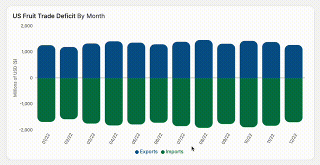
This one should come as no surprise after seeing the tooltip formatting, but it’s a bit simpler! If we’re just trying to format the labels, and not generate their content from scratch, we don’t need to provide a custom component to the content prop. We can use the tickFormatter prop instead, which gives us a value and expects a callback to format that value.
const labelFontSize = 14;

const formatMonthLabelShort = (dateString) => {
  const date = new Date(dateString);
  const options = { year: '2-digit', month: '2-digit' };
  return date.toLocaleDateString('en-US', options);
}

...
<XAxis
  dataKey={xAxisKey}
  tickFormatter={(value) => formatMonthLabelShort(value)}
  angle={-60}
  dy={18}
  dx={-6}
  axisLine={false}
  tickLine={false}
  fontSize={labelFontSize}
/>
<YAxis
  type='number'
  tickFormatter={(value) => value.toLocaleString()}
  axisLine={false}
  tickLine={false}
  fontSize={labelFontSize}
>
  <Label
    angle={-90}
    position='left'
    style={{ textAnchor: 'middle' }}
    fontSize={labelFontSize}
 >
    {yAxisLabel}
  </Label>
</YAxis>
Besides implementing the tickFormatter prop here, I’ve reduced the font sizes of all the labels and hidden the axis and tick lines (purely aesthetic).
I’ve also rotated and shifted the x-axis ticks. If we have a ton of data (ie. more than 2 years worth), displaying labels horizontally is a huge waste of precious screen real estate. By rotating every x-axis tick element, we can fit over twice as many ticks in the same amount of space! Recharts helps us out here too, by automatically displaying as many ticks as it calculates it can safely squeeze in. You can see in the image below that the width of the card hasn’t changed from our initial layout, but now we are seeing a tick for every month, instead of only every other month!

5. Add hover/click effects to the legend
We’re in really solid shape! You could walk away now and your users would probably be super pleased. But if you want to go the extra mile and really wow them, stick with me as we add some nice-to-have functionality to the legend.
We’ll introduce two new features:
If you hover a specific key in the legend, the opacity of all other bars in the graph will be reduced, drawing the user’s eye to the bars of the applicable category.
If you click a key in the legend, all its corresponding bars will be hidden in the graph. Clicking the key again will show the bars. This functionality exists in many other graphing libraries, so your users might expect it, but it’s never been officially implemented in Recharts.
Let’s start with the hover effect.
...
const [legendHover, setLegendHover] = useState(null);
...
return (
...
  <BarChart>

    {dataStyles.map((b) =>
      <Bar
        opacity={(legendHover === null || b.id === legendHover) ? 1 : 0.8}
        style={{
          ...
          transition: `fill 0.2s ease, opacity 0.2s ease`
        }}
      ...
    }
    <Legend
      wrapperStyle={{ cursor: 'pointer' }}
      iconType='circle'
      iconSize={12}
      onMouseEnter={(payload) => { setLegendHover(payload.dataKey) }}
      onMouseLeave={() => setLegendHover(null)}
    />
...
This is pretty straightforward. We’ve set up a new piece of state for the current legend item that’s hovered, and we track it via the item’s dataKey. We’ll set the opacity of the Bar element to be 100% if the hovered element is null or matches the bar’s id, and otherwise, reduce it to 80%. We’ve also added a smooth transition to the opacity styling and added a pointer cursor and circle icons to the legend.
Hiding entire datasets from the graph will be a little more complicated. To pull this off, we’ll add one last piece of state to keep track of the visibility of all the datasets in the graph.
...
const [shownDatasets, setShownDatasets] = useState(
  dataStyles.reduce((obj, item) => {
    obj[item.id] = true;
      return obj;
  }, {})
);

const handleLegendItemClick = (id) => {
  setLegendHover(null);
  setShownDatasets({
    ...shownDatasets,
    [id]: !shownDatasets[id]
  })
}
...
{dataStyles.map((b) =>
  <Bar
    dataKey={b.id}
    hide={!shownDatasets[b.id]}
...
<Legend
  ...
  onMouseEnter={(payload) => shownDatasets[payload.dataKey] && setLegendHover(payload.dataKey)}
  onMouseLeave={(payload) => shownDatasets[payload.dataKey] && setLegendHover(null)}
  onClick={(payload) => handleLegendItemClick(payload.dataKey)}
/>
We use the array
reducefunction to create a list of booleans corresponding to each dataset’s id, which we store inshownDatasets.When the user clicks on a legend item, we use the spread syntax to maintain all the existing booleans, but invert the visibility state of the selected dataset.
I’ve updated the mouse enter/leave handlers because we don’t want to change the opacity of the other bars if the user hovers on a hidden item in the key.
In the same vein, within the
onClickhandler I includedsetLegendHover(null)because we want to reset the opacity of the other bars if the user hides the currently hovered item, and if user has just shown an item, we probably don’t want to immediately fade the other bars (if you did want that, you could just specifyshownDatasets[id] && setLegendHover(null)).We use the
hideprop on theBarelement to reflect the visibility from the legend click. If we used a conditional to generate the bars within the map ({shownDatasets[b.id] ? <Bar> : null}), the dataset would be effectively removed from the entire graph, including the legend, so there would be no way for the user to restore its visibility.
We could call it quits here and be perfectly happy, but there’s a couple more aesthetic niceties we could implement:
Let’s hide the ReferenceLine and round all corners of the bars if we’re only showing data on one side of zero (in this case, if either exports or imports are hidden).
...
const checkVisibleDataIsBilateral = (data, xAxisKey, shownDatasets) => {
  let hasPositive = false;
  let hasNegative = false;

  for (const item of data) {
    for (const key in item) {
      if (key !== xAxisKey) {
        if (item[key] > 0 && shownDatasets[key]) hasPositive = true;
        if (item[key] < 0 && shownDatasets[key]) hasNegative = true;
        if (hasPositive && hasNegative) return true;
      }
    }
  }

  return hasPositive && hasNegative;
};

const [hasBilateralData, setHasBilateralData] = useState(checkVisibleDataIsBilateral(data, xAxisKey, shownDatasets));
...
const handleLegendItemClick = (id) => {
  setLegendHover(null);
  const newShownDatasets = {
    ...shownDatasets,
    [id]: !shownDatasets[id]
  };
  setShownDatasets(newShownDatasets);
  setHasBilateralData(checkVisibleDataIsBilateral(data, xAxisKey, newShownDatasets));
}
...
{hasBilateralData && <ReferenceLine y={0} stroke='gray' />}
{dataStyles.map((b) =>
  <Bar
    ...
    radius={hasBilateralData ? radiusArray : barRadius}
...
I’ve created a helper function to check if there is at least one positive and one negative value present in the datasets which are currently visible. We’ll exit the loop early (returning
true) if we find a match for this condition.We’ll use that function to inform the initial state of
hasBilateralData.When the user clicks an item in the legend, we’ll call that function and update
hasBilateralData.We’ll hide the reference line and redraw the remaining dataset with all four corners of each bar rounded if we don’t have bilateral data.
Finally, let’s do some nitty-gritty CSS fine tuning on the legend items. I want to accomplish three things here:
Recharts spaces out each legend item with
margin-right:10pxrather than using flex with the gap property or similar. This results in the legend appearing slightly left of the center of the container. Let’s remove that margin from the last child in the list so the legend is properly centered.The
cursor: ‘pointer’styling on the wrapper applies the cursor effect anywhere inside the legend wrapper, which takes up the entire width of the container. However, clicking within that wrapper on anything but a specific legend item won’t actually do anything. Let’s ensure only the actual legend items show the cursor.Let’s add a smooth transition to the color of the icon & text when the corresponding dataset is hidden.
We’ll do this by targeting the legend items via HTML class selectors, within our CardContainer styled component. You could also use the custom content prop for the Legend component to accomplish something similar, but this is a bit simpler for our purposes.
const CardContainer = styled.div`
  ...
  .recharts-default-legend {
    li:last-child {
      margin-right: 0px !important;
    }
    .recharts-legend-item {
      cursor: pointer;
      .recharts-symbols {
        transition: fill 0.2s ease;
      }
      .recharts-legend-item-text {
        transition: color 0.2s ease;
      }
    }
  }
`;
That’s it! Here’s a quick demonstration of all the things we can do with our chart now:

I hope this tutorial has been helpful! Stay tuned for more, I’ll be expanding this graph even further (adding a control panel and additional datasets) and discussing how I wrote a comprehensive unit test suite in Jest for this component!